Quiet Mind Creative
How to Make a Favicon Work in Dark Mode
Our plum favicon nearly vanishes on a dark browser tab. What works for dark mode favicons today, from one safe color to an SVG favicon, and how to test it.
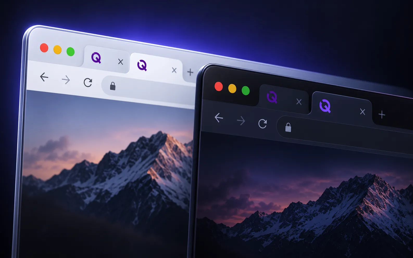
The Quiet Mind Creative favicon is a Q in our Plum, #550E78, on a transparent background. On a light browser tab it looks fine. On a dark tab it almost isn’t there. Plum has a contrast ratio of about 12:1 against white and somewhere between 1:1 and 1.4:1 against the dark grays browsers use for tabs, so in dark mode our icon is very hard to find.
It’s an easy problem to ship, because a favicon tends to get judged on a white artboard or beside the page it belongs to, and it’s displayed in neither place.
A favicon isn’t on your page
The icon sits in the browser’s own interface: the tab strip, the bookmarks bar, the history menu. Its background belongs to the browser and has nothing to do with your site’s colors, or with whether your site has a dark theme of its own. That background also changes more than you’d expect. The active tab is a different shade from the inactive ones, both change when the operating system switches between light and dark, and a private window in Chrome is dark whatever the system is set to.
So there are at least four backgrounds to check: a light active tab, a light inactive tab, a dark active tab, and a dark inactive tab. Checking the icon against your page tells you about none of them.
One icon that works on both
The simplest fix is an icon that doesn’t need to change, and there are two ways to get one.
The first is to pick a color in the middle. One flat color can only do so well against white and dark gray at the same time. The best case works out to somewhere between 3:1 and 4:1 against each, depending on how dark the browser’s tabs are, which is right around the 3:1 that accessibility guidelines ask of graphics. It takes a mid-tone to get there. Plum is far too dark, and a pale tint would fail the same way on light tabs.
The second is to give the icon its own background, such as a white mark on a filled square or circle. The contrast that matters is then inside the icon, and it holds on any tab color, including the ones you didn’t think to test.
Either way there’s one file, every browser shows the same thing, and nothing has to switch.
An SVG favicon that adapts
An SVG favicon can carry its own styles, including a prefers-color-scheme media query, so a single file can change color in dark mode:
<svg xmlns="http://www.w3.org/2000/svg" viewBox="0 0 32 32">
  <style>
    path { fill: #8b6cf6; }
    @media (prefers-color-scheme: dark) {
      path { fill: #b09aff; }
    }
  </style>
  <path d="..." />
</svg><link rel="icon" type="image/svg+xml" href="/favicon.svg" />The technique is real, and support for it is uneven. Firefox applies the media query and updates the icon the moment the scheme changes. Chrome and Edge apply it too, but a tab that’s already open keeps its old icon until the page is reloaded, so someone whose system turns dark at sunset can spend the evening looking at the light-mode icon. Safari has only supported SVG favicons at all since version 26, and it currently ignores the media query and draws the default styles, which is an open bug in WebKit. Older versions of Safari need a PNG or ICO fallback alongside the SVG.
There’s a second limit that no browser fix will remove. The media query reports which scheme the visitor prefers, and that isn’t the same fact as what color their tab is. A private window in Chrome on a computer set to light mode has dark tabs and a light preference, so it gets the light-mode icon on a dark background.
That’s why the example above starts from a color that already works on both. The default styles are what Safari draws and what every mismatch falls back to, so they have to be safe on their own. The dark override is a refinement on top. If you put your brand’s dark color in the default instead, it will look better in light mode and go missing in all of those cases.
Swapping the icon with JavaScript
The other way to switch is from the page. A script listens for the scheme changing with matchMedia('(prefers-color-scheme: dark)') and points the icon’s <link> at a different file. This updates without a reload in Chrome and Firefox, which the SVG approach doesn’t manage in Chrome, and it’s the only route if your icons are PNGs.
It’s also a script on every page in service of sixteen pixels. It only works while the page’s JavaScript is running, Safari has a history of not noticing a favicon that changes after the page loads, and it has the same blind spot about private windows and themes. We’d reach for it last.
What we’d do, and how to test it
Start with an icon that works on both, because that’s the only version every browser will show. Add the dark override in the SVG if the extra contrast is worth a second color. For ours, that means the Q moves from Plum to a mid-tone violet from the same palette, light enough to read on a dark tab and dark enough to hold on a white one.
Then test it where it lives. Switch the operating system between light and dark, and look at the icon in an active tab and an inactive one each time. Open a private window. If you’re choosing a color, use a color picker to pull those tab backgrounds into your design file and try the icon against each of them. Browsers also hold on to favicons for a long time, so if a change doesn’t show up, give the file a new name or a version query before deciding it didn’t work.
Small as it is, a favicon is on screen for as long as someone has your site open. It’s the sort of detail we care about on the websites we build, our own included.
How we can help
Website design and development
Marketing, product, and content sites, designed and built down to the details, then launched and looked after.