ServicesProduct design

Product design that starts with how it works.

Discovery, structure, user flows, wireframes, prototypes, and the finished interface. We work out what the product needs to do and how people will move through it, then design every screen and state, so whoever builds it isn’t guessing.

  1. SenderChooses a file and how long the link lasts
  2. The file is encrypted in their browser
  3. The link is shown once, to copy

Opened before it expires?

Yes

  1. RecipientDecrypts it in their browser, no account needed
  2. The link burns, and the file is deleted

No

  1. The link expires, and the file is deleted
Burn After’s core flow: two people, one link, and a clean ending either way.

What we do

Most of design happens before anything looks finished.

The expensive mistakes in a product are usually made early, in what it does and how it’s organized, long before anyone picks a color. So that’s where we start.

  1. Structure

    • Discovery

      Who it’s for, what they’re trying to get done, what they use today, and the constraints you’re really working under. If what you asked for won’t solve the problem, we’ll say so.

    • Structure

      What the product needs to do and, just as important, what it doesn’t. The content, the things people work with, and how they relate, before there are any screens.

  2. Wireframe

    • User flows

      The paths people take to get something done, including the unhappy ones: errors, empty states, permissions, and coming back tomorrow to finish.

    • Wireframes

      Plain layouts that settle hierarchy and placement while changes are still cheap to make.

  3. Prototype

    • Prototypes

      Clickable prototypes you can try on your own phone or laptop, so decisions get made by using the thing.

    • Every screen, everyone

      Phones get layouts of their own. Contrast, type size, focus, and touch targets are designed in from the first screen.

  4. Interface

    • Interface design

      Typography, color, spacing, and motion for every screen and state, in light and dark when the product needs both.

    • Handoff

      Specs, components, and every state, ready for whoever builds it. Often that’s us, which keeps the design honest about what’s practical.

Proof

Decisions you can see in our own apps.

Every screen in a shipped product is a stack of decisions. Here are a few from two of our iPhone apps, and the reasons behind them.

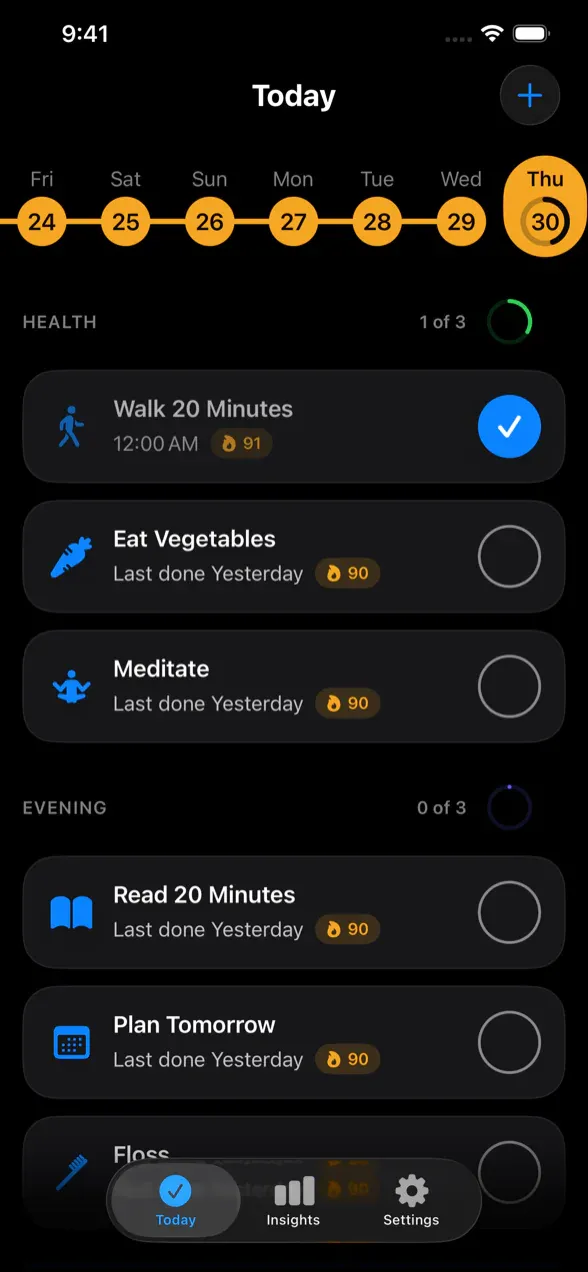
Tango’s Today screen: a health routine and an evening routine, each habit with a large check button.

iPhone app

Tango

  1. Today shows only what’s scheduled right now. Everything else can wait.
  2. Habits are grouped into the routines people actually keep, so the day reads as a few intentions instead of one long list.
  3. Big touch targets and no ceremony: one tap and it’s done.
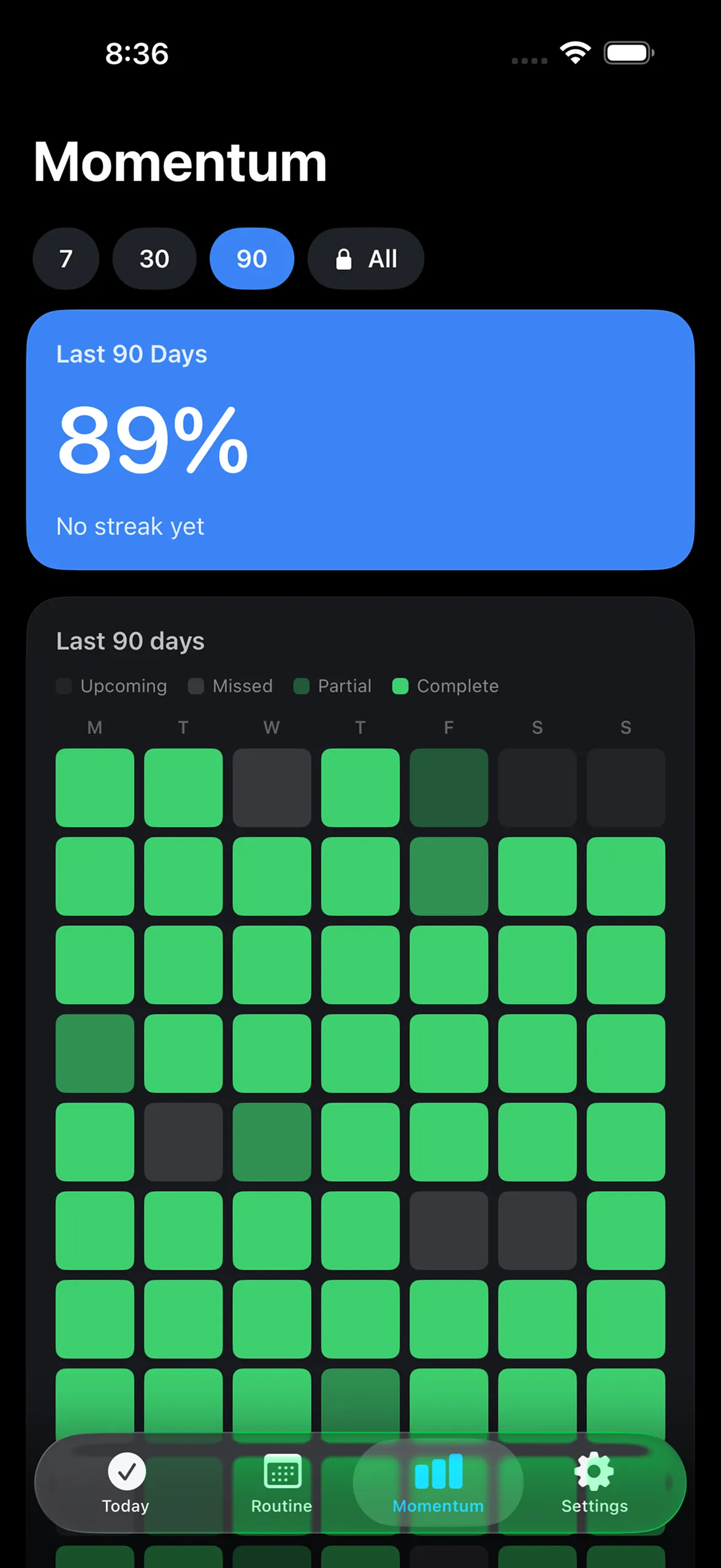
Momentum’s stats screen: 89 percent consistency over the last 90 days, above a heatmap of complete, partial, and missed days.

iPhone app

Momentum

  1. Consistency over 7, 30, or 90 days. All-time history comes with the one-time Pro unlock.
  2. The big number is a percentage, so a missed day lowers it a little instead of resetting it to zero.
  3. Partial days show as partial, and planned rest days count as success.

Interface design

Then the details, measured.

Once the structure holds, the interface gets the same attention. These measurements come from the live Burn After site.

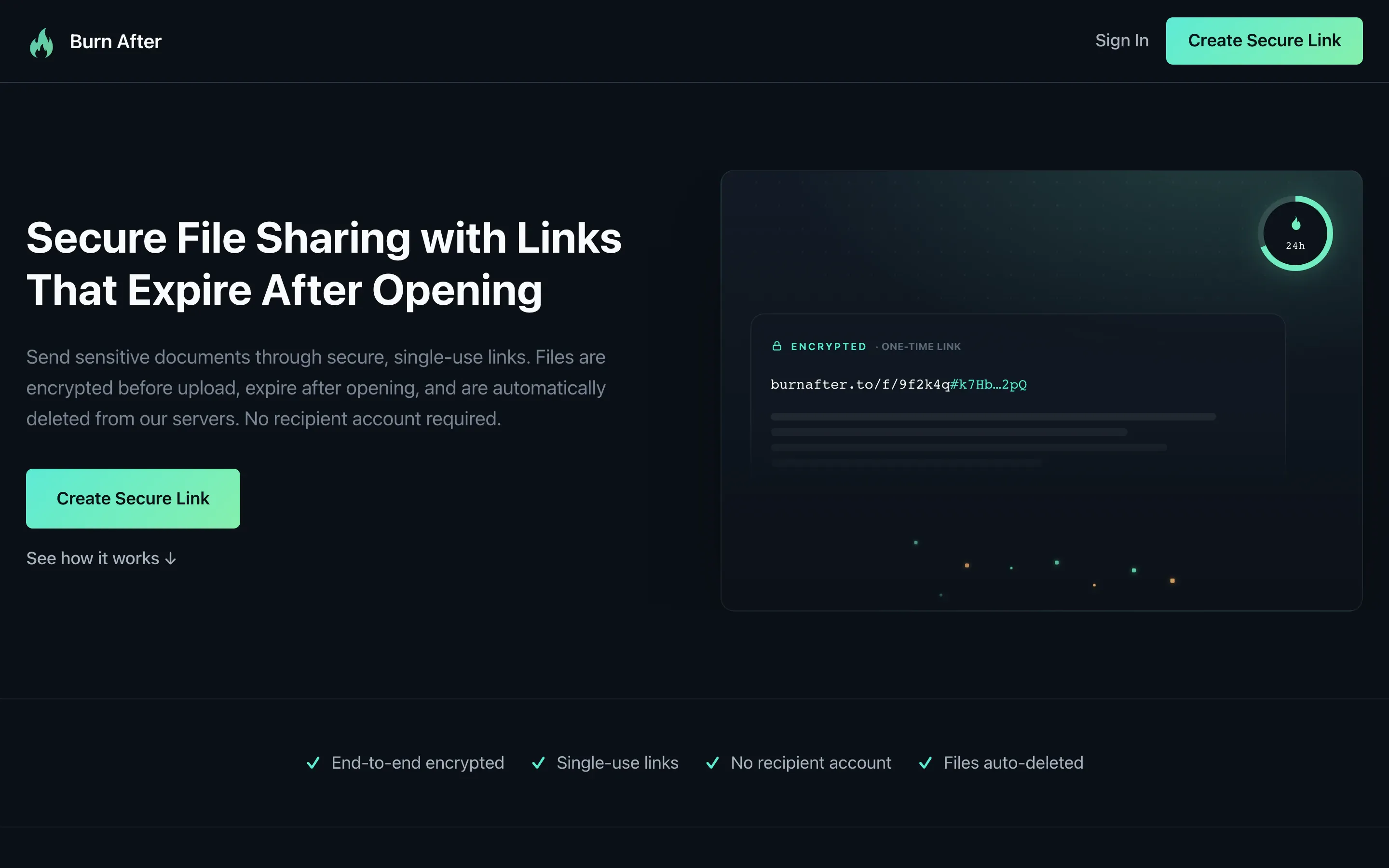
The Burn After home page: a headline, a short paragraph, and a Create Secure Link button beside an encrypted link preview.
  • 5.0 : 1Body text contrast, comfortably past the 4.5 : 1 that accessibility guidelines ask for.
  • 62 pxThe height of the main button, an easy target for a thumb.
  • 27 pxBetween headline and body, so the hierarchy reads at a glance.

Design systems

A system, when the product is big enough to need one.

A design system turns one-off screens into reusable decisions, so the hundredth page looks like it belongs with the first. Small products often need just a handful of shared styles. We size it to the product.

This site’s design tokens
  • Black#000000
  • Raised#16161B
  • White#F5F5F7
  • Dim#A1A1A6
  • Ink#1D1D1F
  • Violet#B09AFF
  • Plum#550E78
  • Mint#5EEAD4
  • Display · Geist 650 · tight tracking
  • Headline · Geist 620 · up to 48 px
  • Lede · Geist 400 · up to 20.8 px
  • Eyebrow · Geist Mono 500 · 12 px, uppercase

This page’s colors and type styles start from tokens like these, in both themes.

Good fit

When it’s worth designing first.

And when you want it built too, we do that as well: websites, web apps, and iPhone and Mac apps.

  • You have an idea and need to work out what the first version actually is.
  • Your product works, but people get lost, stuck, or confused along the way.
  • You’re about to spend real money building, and want the expensive questions answered while they’re cheap.
  • Your product grew one feature at a time and needs a structure again.
  • You have developers and need designs they can build from without guessing.
  • New screens keep coming out slightly different, and you need a system so they stop.

From the blog

How we think about design

  • · 6 min read

    Good Design Reduces Cognitive Load

    Good design does more than look good. It reduces the amount of mental effort required to understand what is happening, decide what to do next, and get something done.

  • · 4 min read

    What "Quiet Mind" Means to Us

    Quiet Mind is not about minimalism or a particular design style. It is about the confidence that comes from knowing the work is handled.

Before you ask

Questions

Do you only design, or do you build too?

Both. Most of what we design, we also build, which keeps the design honest about what’s practical. If you have developers of your own, we’ll hand off designs they can build from.

What do we get at the end?

Whatever the build needs: flows, wireframes, a clickable prototype, finished designs for every screen, state, and size, and a component library or design system if the product calls for one.

Do we need a design system?

Not always. It pays off when several people build screens over time, or when the product is big. A small site may only need a few shared styles, and we’ll tell you which you are.

Can you redesign a product we already have?

Yes. We start by learning how it works today and where people struggle, then change what needs changing. If someone else built it, taking over existing software covers how we get to know it.

Where does accessibility fit in?

From the first screen: contrast, type size, focus states, touch targets, and reading order are part of the design. That’s much easier than fixing them after launch.

Contact

What are you trying to figure out?

Tell us about the product and the people it’s for. We’ll get back to you as soon as possible.